Cylindo has unveiled a new brand identity, including a simple and elegant logo and vibrant brand personality.
We are witnessing an undeniable and nonreversible shift in the retail landscape towards digital transformation of the businesses. The new brand identity is a strong signal that Cylindo is going into the new era with confidence and determination.
“Cylindo is undergoing a very exciting transition period. We’re transforming from a product company to a true platform company that offers our clients and partners new and unseen ways of working with visualization. This makes it the perfect time to update our logo and brand to reflect who we are as a company today” – said Janus Jagd, CEO.
The company has gone through a lot of changes and we are still changing. We are growing. The new brand identity is a reflection of our urge to innovate and to constantly challenge the status quo.
“Our starting point was the previous brand identity. We wanted to keep as many of the qualities from the old logo as possible, while at the same time create something original and incorporate the core values of Cylindo into the new logo” – said Kristian Sørensen, Lead UX/UI Engineer.
KEY PRINCIPLES: CORE, DEPTH, MOVEMENT, BALANCE
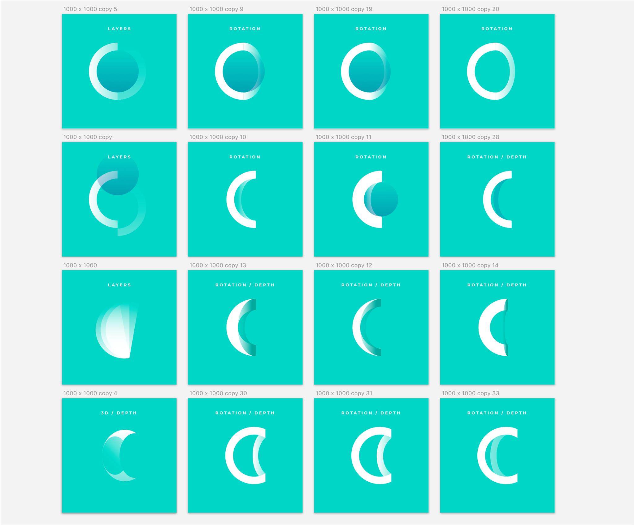
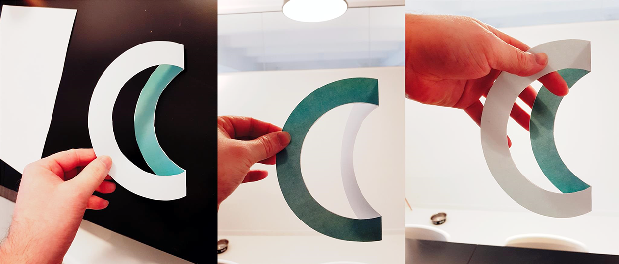
Create. Test. Repeat
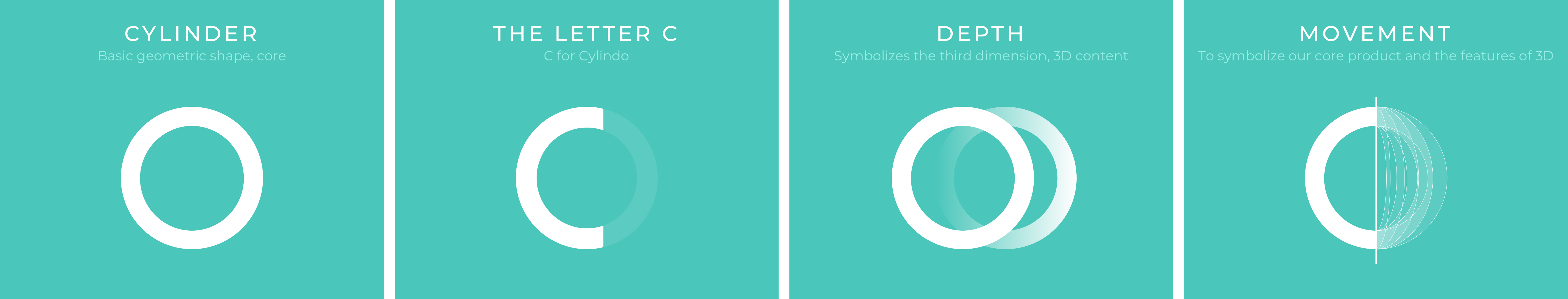
CORE – Building on Solid Foundations
It all starts with a basic geometric shape. A cylinder. The core of the logo design. It represents unity, focus, and infinity. It also symbolizes our core strength – a smart platform that completely transforms the customer journey delivering superior product visualization together with powerful tools for optimized product page experiences.
DEPTH – Into the Third Dimension
Cylindo empowers brands and retailers to show their products from any angle in any variation by using 4K HD Zoom and 360-degree spin. Having this in mind, a flat logo design was not the right choice for us. It couldn’t represent the essence of our business in the right way. The depth of the logo symbolizes the third dimension. It represents the high-quality 3D content Cylindo delivers to its customers. It adds an extra element of visual sheen and perspective, making the logo stand out from other more or less expected logo designs.
The story behind the new logo
MOVEMENT – Panta Rhei: Everything Flows
What better way to illustrate the unique 360 spin feature of Cylindo platform than with the idea of an evermoving logo. The constant motion symbolizes the core feature of the 360 HD Viewer, but it also embodies Cylindo’s drive to move, to improve, to innovate. To never settle.
BALANCE – The Math Behind the Beauty
The new logo is constructed by incorporating the Golden ratio which makes it natural looking and aesthetically pleasing to the eye. It’s both art and science, but what is most important it’s balanced and compelling. It has a natural flow.
The Golden ratio abounds in nature. You can find it in some of the most symmetrical shapes on Earth. It’s one of those experiences that leave you in awe, having a single thought: Nature is perfect!
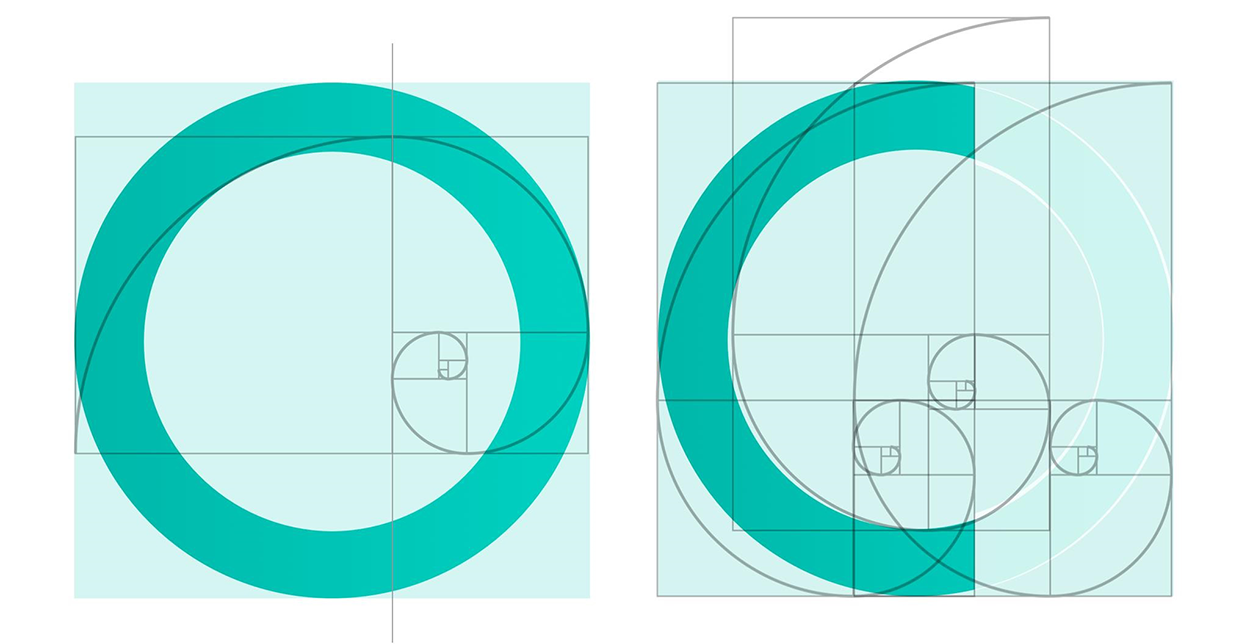
The Golden ratio
STAY ORIGINAL
Creating a memorizable logo that conveys your brand message in the right way is a very challenging task. It’s a complicated process with one end result in mind: a simple visual element that will tell your brand’s story in a split second. “When it comes to letter logos, especially the letter C, almost everything has been done before. I did a lot of research and it was pretty astonishing that almost anything that I thought of initially has already been done. So the biggest challenge was to create something truly original and to incorporate the brand vision at the same time.” – said Kristian Sørensen, Lead UX/UI Engineer.
The future shape of commerce 🙂
SHAPING THE FUTURE OF COMMERCE
This is not just a new logo. It’s a very significant signal to our clients that we are changing. Cylindo is growing. We are more than a good product. We are the fastest growing product visualization platform for commerce on a quest to create enjoyable shopping experiences and to give brands and retailers the right tools to engage and convert audiences across channels.
“This is more than a logo change. It’s a brand promise that we will deliver the best product page user experience and that we’ll go beyond clients expectations with constant innovation” – said Kristian.
Shaping the future of commerce requires energy and drive. We have both.
The result of this rebranding process is simple and elegant visual identity that lives across a diversity of devices. Memorable. Timeless. Versatile. On its way to becoming a recognizable symbol of Cylindo’s future success.
Kudos to Kristian Sørensen, our Lead UX/UI Engineer for the stunning logo.