Online shopping cart abandonment rate varies from 50% to 80% depending on the industry. According to Statista, the abandonment rate in retail for the first quarter of 2018 was 75,6%. In other words, ¾ of customers who add products to their carts drop out before they complete the checkout process.
Even though cart abandonment is somewhat a natural way of e-commerce sites browsing, still there are some things that are under your control. With minor fixes you can significantly decrease this rate.
Start with ‘Why’
So what is the main reason for cart abandonment? Why visitors leave your website?
The answer is quite simple: Bad user experience.
Research from Adobe shows that the customer who had an unpleasant experience is 88% less likely to return to your website. When customers are frustrated with your site or the process involved in completing the transaction, they will most likely go to a competitor’s site and buy what they need.
Analyzing your shopping cart abandonment rates can be a good starting point towards improving UX. According to Baymard extra costs, requesting profile creation, and complicated checkout processes are among the main reasons for drop out.
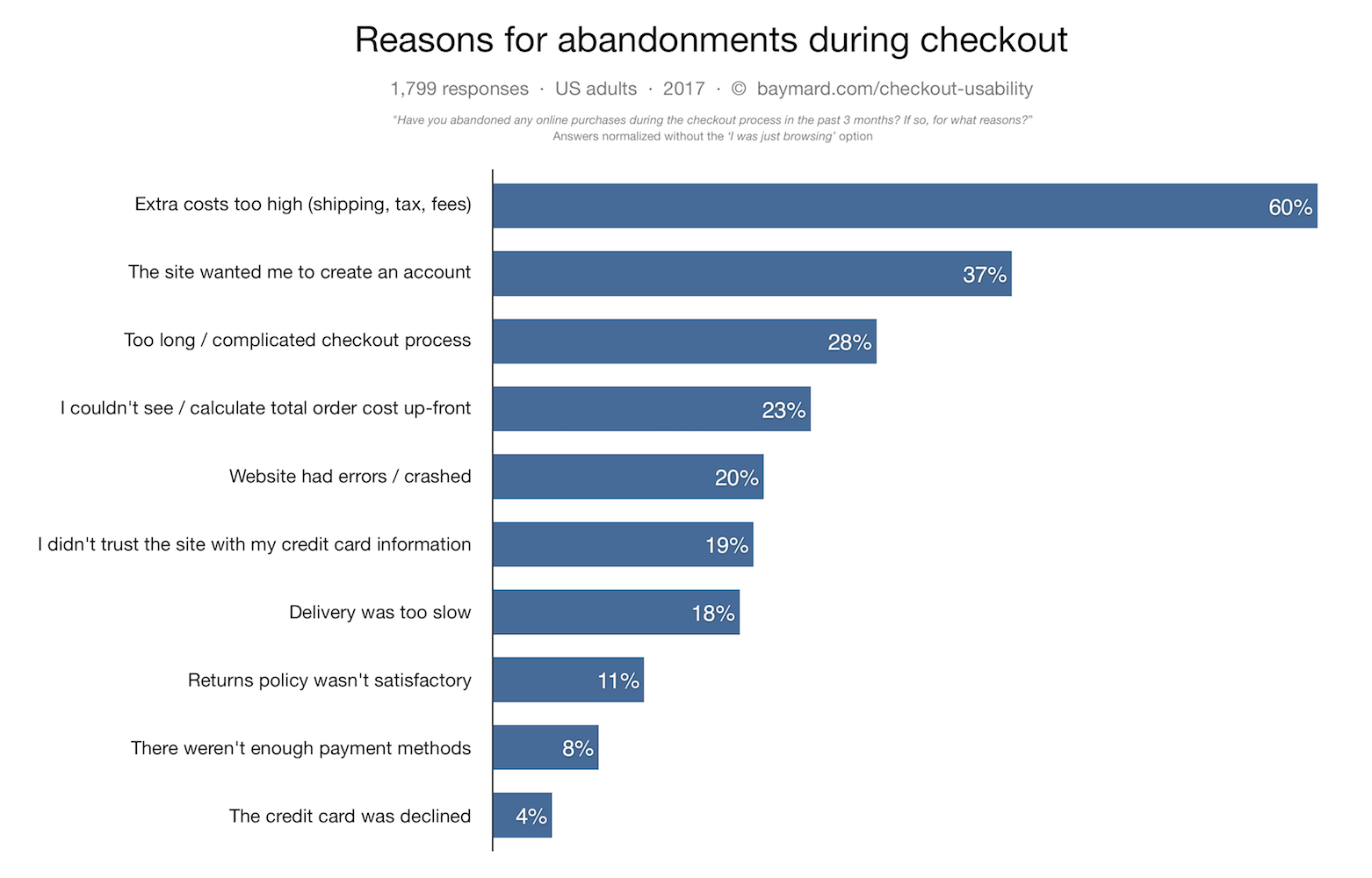
Source: Baymard
It’s important to know that higher traffic doesn’t necessarily mean a higher conversion rate. In fact, if you don’t work on your UX before attracting more visitors to your e-commerce store, your bounce rate will explode, and you risk negative word of mouth.
Here are some of the most common product page UX pitfalls. For most of them, professionals are well aware of, but they somehow choose to ignore thus facing high bouncing rates.
Know your customer
Put yourself in your visitor’s shoes. Try looking at your website the way customers see it. Is it easy to navigate? Can you find all the information you need? Understanding how prospects behave can help you improve the flow on your site, and to provide a frictionless experience.
Know your ideal customer. Define your persona. Remember the 80/20 rule? 20% of your customers represent 80% of your sales. Find your best customers and provide them the excellent customer journey. The smartest thing you can do is to analyze your visitors’ behavior and fix all the hiccups. Another option is to ask your customers for feedback. The valuable insight they share with you can be a gamechanger for your business.
Obvious always wins
Did you have any doubts that less is more? Well when it comes to UX, once and for all: Less is more. Today’s consumers don’t have time to wander around. Even if they do, they don’t want to spend their hours browsing sites for information, feeling inferior and frustrated.
- Pave the way to the “add to cart” button – Make your C2A as clear as possible. Excess clutter causes confusion, and no one likes feeling confused. Make your UX clean, simple and self-explanatory. Customers expect to finish a transaction in a few steps. Companies that recognize this are constantly trying to simplify processes, like Amazon introducing the 1-Click Ordering.
- Website navigation is crucial – The main purpose of navigation is to help customers find what they are looking for and to know where they are. If users have a hard time navigating through your website, they will most likely visit your competitor’s site.
- Optimize your site for searchers and browsers – Make sure that your site is optimized for both, searchers and browsers. Some of the prospects know exactly what they want, but some of them want to explore your site before they decide.

“First, make sure that you are covering the basics of good web design. Meaning is your website intuitive, easy to navigate, is the look of the website consistent with the brand etc. With that covered, now try to focus on how to make your visitors feel confident and secure enough to make a purchasing decision. Help them by aiding them in their search for the “right” product, and when they find it boost their confidence with social proof like customer feedback and reviews. It’s all about trust. “ – Kristian Sørensen, Lead UX Front-end Engineer, Cylindo
Need for Speed
We live in a world of instant gratification. Customers have the power to choose and it’s easier than ever to switch brands.
There’s no second secоnd to make a first impression. No, this is not a typo. You literally have less than a second. Research shows that the average web user forms an opinion about a brand within two-tenths of a second.
According to Soasta, customers are impatient when it comes to web performance and digital customer experience:
- 50% of unsatisfied visitors will go to a competitor’s website
- 35% will have a negative perception of the brand and
- 22% will never return to the slow site.
Read one of our previous blog posts to learn more about the importance of page load speed and how it can affect your business.
Stories tell visuals sell
People rather engage with the visual elements of a product page that with a detailed product description. You have to show more to sell more. It’s no surprise that e-commerce businesses invest in product visualization technologies.

“On the product page, the first job of imagery is to deliver inspiration. The customer, especially on mobile, has a limited attention span and needs to be hooked quickly. Use lifestyle shots that present the product in a variety of settings to spark their imagination and ignite desire. Your next job is to prompt engagement. Encourage customers to play with the product trying out different fabrics and finishes, and to visualize the product in their own setting. Finally, use imagery to deliver reassurance. Let the customer examine the product in as much detail as possible, with high definition close-ups and 360˚ capabilities. Answer as many questions as you can through imagery to give them the confidence to click the add to basket button” – David Kohn, Customer and E-commerce Director, Heal’s
Here are some of the main aspects e-commerce businesses have to consider when it comes to product visuals:
- Number of images – According to a recent study by Salsify products with more images and videos convert more, even if they have more features than the shopper needs and cost more.
- Image quality – Quantity is important but make no mistake. When it comes to the e-commerce world, high-quality visuals are non-negotiable. Superior images lead to higher conversions. Visuals with low quality have the contrary effect.
- Zoom in – The beauty lies in the details. According to research from Blueport, retailers perceive the zoom function as one of the 10 most valued features for providing augmented and consistent information across channels. With 75.9 points, zoom is number one feature for rich furniture merchandising. For a better understanding of this topic read our blog post about product zoom.
- Context matters – In-context images empower businesses to trigger emotions by telling stories. And this is not just a theory. According to BigCommerce, 78% of online shoppers want products to be brought to life with images.
- Engaging shopping experience – Online shoppers crave for engaging experiences, that is why we are witnessing an introduction of product visualization technologies like 360-spin or AR/VR technologies that can result in increased conversion rates.
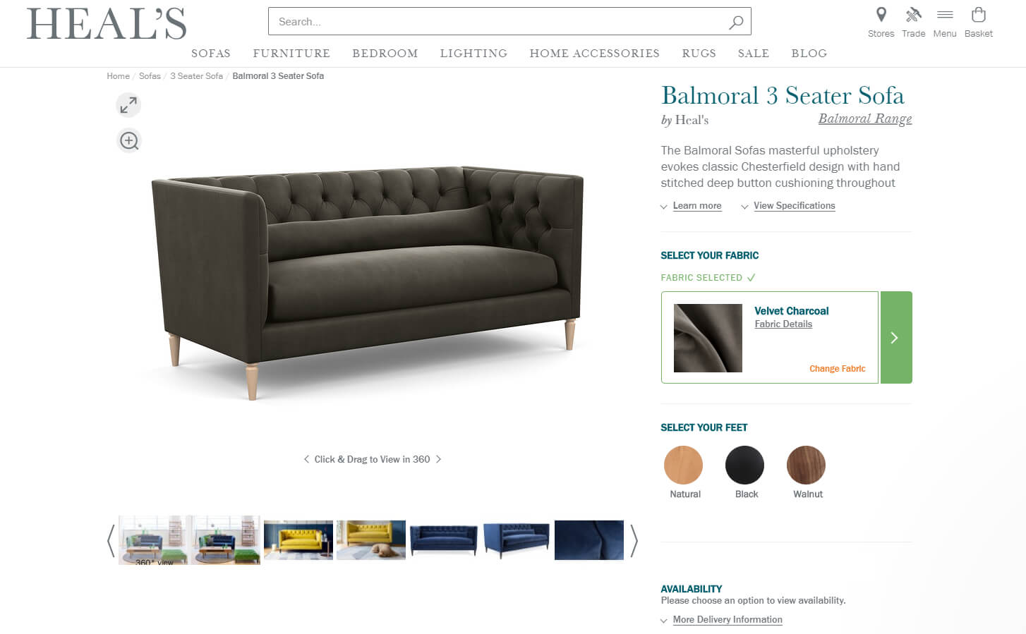
Source: Heal’s
Simple checkout experience
Too long and complicated checkout process is the reason no.3 for cart abandonment (28%). If we add the percentage of users that drop out because they don’t want to create an account (37%), we can see that the checkout experience is one of the crucial points of the customer journey.
When asked what features are most important for increased conversion, more than 48% of the respondents answered that guest checkout positively influences their buying decision.
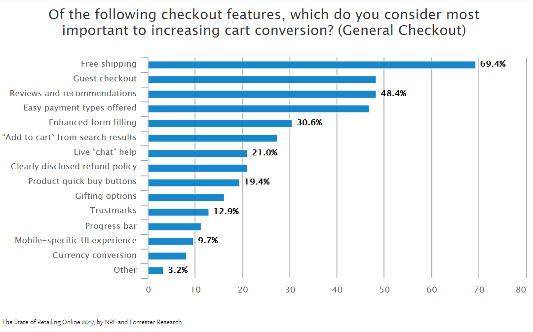
Source: NRF
Sometimes visitors want to enter your site, find what they need and buy it. No profiles creation, opening accounts or wasting time. It can be due to privacy concerns, or just because they don’t want to be spammed. However, if you force them to register to buy something, it’s very likely that you will face a high bounce rate.
Give them the chance to choose between registering and a guest checkout and find a smart way to encourage them to give you their personal information. Offer them an incentive, or a personalized experience. But once they register, make sure to reassure them it was worth it. Don’t ask them to fill in forms everytime they shop. You have their information so you can make their life easier.
One other thing which is very important for a pleasant checkout experience is to show an image of the product your visitor is buying in the shopping cart. This way you avoid confusion, and you remind your customers what they added to their cart. Just imagine how much effort and money you will save if you reduce the number of returned items due to wrong color, size, or even a wrong product.
What does the future hold?
We are witnessing changes in every segment of our life as a consequence of the digital revolution. The way we interact with people, the way we get information, how we shop, how we pay – everything. Product page user experience is also evolving constantly.
The introduction of conversational UX, voice search and barcodes will move the needle and change the customer journey forever. Are you ready for this shift?